
Learn how to increase your lead form conversion rates with these 12 proven strategies. This article explores powerful methods for increasing conversion rate on both website forms and facebook lead forms.
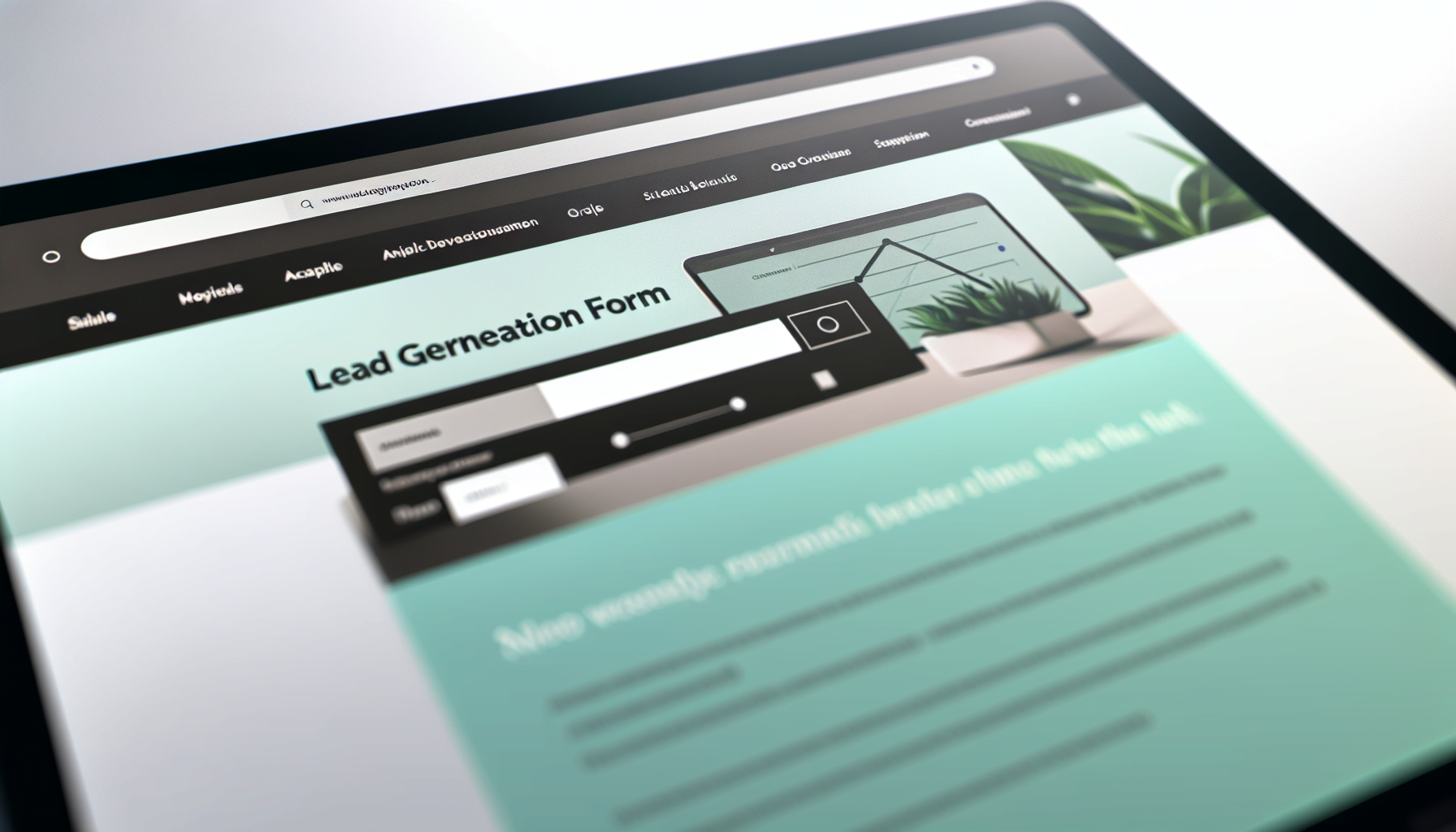
1. Optimizing Form Length for Maximum Engagement

Have you ever faced a form so long it felt like a Herculean task to complete? We’ve all been there, and so have your potential leads. The golden key to unlocking higher engagement lies in striking the perfect balance between brevity and necessity. It’s a delicate dance—too many form fields can deter even the most interested visitors, yet too few might leave you with insufficient data to work with. Studies have shown that users’ patience is waning, with session durations dropping since 2021. So, keep it short and sweet; a concise form is a friendly form.
The magic number? Research points to three form fields as the ideal number to maximize form conversion rates. It’s not about cluttering your form with fields—it’s about curating them. When you zero in on the essentials, each field justifies its existence on your landing page. Every additional field should be weighed against its value in the lead generation process. Remember, when in doubt, less is more.
Determining Essential vs. Optional Fields
What’s vital for one business may be superfluous for another. The essential fields on your form should echo the heartbeat of your lead generation process. They’re the non-negotiables—the data you need to contact, qualify, and connect with your leads. But how do you sift the wheat from the chaff? It all comes down to your prospects’ stage in the buyer’s journey and your sales team’s prowess in nurturing leads. Dive into your buyer personas and tailor your form fields to their unique needs, ensuring every question brings you closer to your goal.
The number of essential fields also depends on your sales team’s requirements to follow up leads effectively. After all, an overwhelmed sales team can mean missed opportunities. And let’s not forget the role of automation—today’s sophisticated systems can help nurture leads, allowing for a lighter touch on your form. Concentrating on what’s crucial will resonate with users, enticing them to effortlessly fill out your form.
The Psychology Behind Form Field Numbers
Why does the number of fields matter so much? It’s all in our heads—literally. Cognitive load, or the mental effort required to complete a task, plays a huge role in whether someone will fill out your form. Fewer form fields are like a welcome mat, inviting users in with the promise of an effortless experience. A reduction in form fields from four to three can cause conversion rates to surge by almost half—a remarkable testament to the power of simplicity.
2. Strategic Placement of Lead Generation Forms
Think of your website as prime real estate—where you place your lead generation forms can determine its fate. It’s not just about making it visible; it’s about making it irresistible.
Here are some tips for positioning your form effectively:
Place your form above the fold to ensure it captures visitors’ attention immediately upon arrival.
Analyze your visitor behavior and understand their preferences. Place your forms where they naturally tend to interact.
Test different placements and monitor the performance of your forms. Make adjustments based on the data you collect.
By following these tips, you can optimize your lead generation forms and increase your chances of capturing valuable leads.
For longer landing pages, repetition is your friend. Sprinkle your call-to-action across the page to capture visitors at different stages of their journey. It’s like breadcrumbs leading to a sumptuous feast—your form. Considering multiple placements provides your visitors with numerous engagement opportunities, thereby maximizing the potential for more leads. Remember, form placement isn’t just strategic; it’s an art that speaks directly to your users’ behavior.
Above the Fold: Maximizing Visibility
The fold on your landing page is the new horizon line—it’s where interest peaks and engagement begins. Placing your form above this line is like placing a billboard on the busiest highway; it’s bound to draw eyes. And the impact? It’s significant. The difference in how users treat information above versus below the fold is a whopping 84 percent.
But visibility isn’t just about location; it’s about presentation. Make your form visually appealing, with a strong call to action that stands out from the rest of the content. This isn’t just a form; it’s the gateway to your offers, your services, your brand. Make it count. Making your form a focal point above the fold not only increases visibility but also crafts an attention-grabbing invitation.
Form Placement and User Flow
Once you’ve caught your visitors’ eyes, you need to keep their attention. That’s where user flow comes into play. A form that’s a natural extension of the user’s journey feels less like an interruption and more like a welcome part of their experience. Heatmap analysis can reveal hotspots on your page, guiding you to place forms in areas where users are most active. Additionally, a single-column layout can guide visitors smoothly from field to field, reducing visual clutter and enhancing the flow of information.
But alignment is about more than just aesthetics; it’s about creating a sense of order and predictability. When form elements align consistently across your website, users develop a rhythm, a familiarity that breeds satisfaction and engagement. Be strategic with your form placement, ensuring it aligns with user behavior and the overall web design. From the easiest fields at the beginning to the submit button placed prominently, every element should encourage users to complete the form effortlessly.
3. Crafting Compelling Calls to Action

Your call to action (CTA) is the drumroll before the curtain rises—it needs to be compelling enough to draw a round of applause, or in this case, a click. A CTA that resonates with your audience can be the difference between a new lead and a missed opportunity. It’s more than just a button; it’s a promise of value. Tailor your CTA to tell your visitors exactly what they’ll gain, whether it’s a free ebook, an exclusive webinar, or access to premium content.
Avoid the temptation of cluttering your page with multiple CTAs. A single, strong call to action that aligns with your offer and landing page is the arrow that can pierce the heart of indecision. It’s about clarity and persuasion, drawing on principles that have been shown to maximize conversion rates, such as using action words like ‘DOWNLOAD’ to tap into the power of social proof.
Crafting your CTA with care does more than simply invite users to take action—it inspires them to become part of your brand’s narrative.
Call to Action Copy Best Practices
Words wield power, and in the realm of CTAs, the right words can cast a spell that compels users to act. Think of it as a command, a nudge towards the action you want them to take. Keep it short, direct, and urgent—two to five words that encapsulate the essence of the offer. Context is king, and personalizing the CTA copy can make it resonate on a deeper level with your target audience, addressing their specific needs and challenges.
Testing is the crucible where the strength of your CTA is proven. A/B testing, where each element is scrutinized, can reveal what resonates most with your visitors. Change one variable at a time—whether it’s the design or text—and observe the impact on conversion rates. It’s a continuous cycle of hypothesizing, testing, and refining, always with the goal of crafting a CTA that speaks directly to the heart of your users’ desires.
Visuals and Design Elements
But a CTA isn’t just about the words—it’s a visual beacon, guiding users to take the next step. The design of your CTA button can have a profound effect on its performance. Vivid colors that pop against the page, a size that’s neither too imposing nor too subtle, and a strategic placement that catches the eye—all these elements can increase the likelihood of a click.
Contrast is your ally; it makes your CTA stand out and commands attention, beckoning users to take action. Your CTA should be the star of the show, with a visual hierarchy that ensures it’s the focal point. White space is the spotlight that illuminates it, separating it from other elements and drawing the user’s gaze. And the text? It should be clear, compelling, and impossible to overlook. Use fonts, sizes, and typographical emphasis to make your action phrases leap off the screen and into the user’s consciousness.
A well-designed CTA isn’t just a button; it’s the culmination of your marketing strategy, the final flourish that turns interest into action.
4. Use lead magnets and incentives

Who can resist the allure of a treasure chest? That’s what lead magnets are to your potential customers—a trove of value that entices them to hand over their information. Whether it’s a discount, a free trial, or an exclusive ebook, these incentives can sweeten the deal and make your lead form irresistible. It’s like offering a sample at a gourmet shop; once they taste the quality, they’re more likely to buy the whole product.
And don’t just dangle the carrot—deliver it instantly. Automation can ensure that your lead magnets reach your new subscribers without delay, whether through an automated email responder or even via SMS. This immediate gratification not only delights your users but also reinforces the value of engaging with your brand. Follow up with additional valuable content to nurture the relationship, and you’ll transform a single interaction into a journey of mutual benefit.
5. Simplifying Form Design to Enhance User Experience
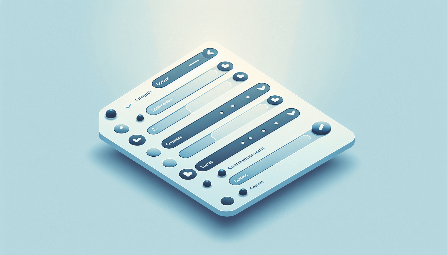
A form’s design is a silent ambassador of your brand, and simplicity is the hallmark of sophistication. By simplifying your form design, you’re not just making it visually appealing; you’re making it user-friendly.
Here are some tips to create a form that invites completion:
Use clear and legible typography
Incorporate ample white space for a clean and organized look
Align form elements vertically for easy scanning and completion
Create a design that reflects your brand identity and makes the user experience smooth and effortless. Remember, a form that respects the user’s time and attention is a form that gets filled out.
But a consistent visual experience goes beyond aesthetics. It’s about creating an intuitive interface that users can navigate with ease. When the form fields align vertically, and the labels are responsive, you eliminate visual distractions and guide users through the process seamlessly. It’s not just about collecting information; it’s about crafting an experience that’s so positive, users are happy to share their details with you.
Grouping Related Fields for Clarity
The layout of your form can speak volumes. When related fields are grouped together, it creates a narrative that users can follow, making the form feel less like a questionnaire and more like a conversation. This logical arrangement reduces the perceived complexity and makes the form approachable, encouraging users to complete it without intimidation.
Imagine a form that guides you gently from one step to the next, with each group of fields leading naturally to the following, like chapters in a story. And in this story, the submit button is the climax. Whether your form is a single step or spans multiple pages, the button should always be in harmony with the fields, providing a clear call to action that beckons users to take the final leap.
By structuring your form with clarity and purpose, you’re not just gathering data; you’re engaging users in a narrative that has a satisfying conclusion.
Using Clear and Concise Labels
Clarity is the cornerstone of communication, and in the realm of forms, it’s the labels that do the talking. Clear and concise labels act as signposts, guiding users through the form and ensuring that each entry is accurate and relevant. When labels are right-aligned or use zebra striping for longer descriptions, they maintain proximity to their respective fields, preventing any confusion that could derail the user’s journey. Think of them as the instructions on a map, pointing users in the right direction with precision and simplicity.
Error messages are the caution signs along the way, alerting users to any missteps before they become roadblocks. When these messages are clear and offer actionable guidance, they reinforce the journey, ensuring that users arrive at their destination successfully. By providing a map that’s easy to read and follow, you’re not just simplifying the path; you’re making it enjoyable.
6. Create a sense of exclusivity

Imagine being part of an elite club, where the velvet rope lifts only for those in the know. That’s the power of exclusivity in your lead forms. By crafting language that whispers of limited access or insider benefits, you tap into the fear of missing out (FOMO). Suddenly, your form becomes a golden ticket, a VIP pass to something special and sought-after. It’s not just about filling out a form; it’s about gaining entry to an exclusive realm.
“Be the first to know,” “Get exclusive access,” “Join an elite group”—these are the phrases that can make hearts race and fingers click. By increasing the perceived value of what lies beyond the form, you significantly increase the likelihood of conversion. It’s a psychological trigger that’s hardwired into our nature, and when used ethically, it transforms your form from a mundane task into a coveted opportunity.
7. Mobile Optimization: Reaching Users on All Devices

In a world where smartphones are as ubiquitous as wallets, mobile optimization is no longer a luxury—it’s a necessity. Contact forms, including online form and web form, should be just as mobile-friendly as your content, given that almost half of web traffic originates from mobile devices. Responsive design principles are key here, ensuring your forms look as good on a phone as they do on a desktop. The goal? To create a seamless experience, where users can glide through your form without pinching, zooming, or squinting.
The design should be:
Simple
Buttons large
Layout intuitive
Clear labels
Ample white space
These features will make for a comfortable experience on smaller screens. Additionally, technical optimizations like speed enhancements and engaging conversational interfaces can dramatically increase mobile form conversions. Remember, every user on a mobile device is a potential lead. Optimizing for mobile extends your reach to a wider audience and embraces the future dynamics of web interaction, ultimately improving your form conversion rate.
8. The Role of Social Proof in Conversion Rate Optimization

Social proof is the digital equivalent of a standing ovation—it’s the public endorsement that can sway potential leads to take action. When visitors see testimonials, reviews, and case studies from satisfied customers, it builds trust and credibility. It’s like having a crowd of people vouching for your brand, showing that your product or service is tried, tested, and loved. Displaying phrases like “Join 10,000+ satisfied customers” on your forms can leverage this collective validation and boost form conversion rates.
But social proof isn’t just about numbers; it’s about stories. A well-placed testimonial or user-generated content can paint a picture that resonates with your visitors’ aspirations. And when it comes to local businesses, the power of online reviews cannot be overstated, with a vast majority of people reading and being influenced by them. Weaving social proof into your form pages does more than furnish evidence—it fosters a community around your brand that visitors will want to join.
9. Reducing Friction with User-Friendly Features
The smoother the process, the more likely the completion—that’s the mantra for reducing friction in your lead forms. User-friendly features like real-time error messages can be the grease that ensures a smooth journey from start to submit. These features act like friendly guides, pointing out errors and offering solutions on the spot, preventing user frustration and form abandonment. When users know exactly what’s expected and how to correct mistakes, they’re more inclined to finish what they started.
But there’s more to user-friendliness than just error handling. Autofill capabilities, inline form validation, and tab key navigation are the unsung heroes that make form completion a breeze. Respecting the user’s time and effort via these features can notably boost the chances of form submission. They’re the small cogs in a well-oiled machine, working together to ensure a seamless experience that leaves users feeling satisfied—not stressed.
10. Continuous Optimization Through A/B Testing
Optimization is not a one-and-done deal; it’s an ongoing quest for perfection. A/B testing is your compass on this journey, helping you navigate the vast sea of possibilities to find the most effective version of your lead forms. Comparing two versions of a form or webpage through A/B testing reveals the subtle differences that can trigger a surge in conversion rates. It’s a process of trial and error, hypothesis and validation, that allows you to refine your approach with precision.
The A/B testing battlefield is strewn with variables, from button colors to font sizes, but the key to victory is clarity. Set SMART goals, define your metrics for success, and observe the results with a critical eye. Analyze both the champions and the underperformers; each holds valuable lessons that can inform your future strategies and help you hone in on what truly resonates with your audience. Continuous optimization is the hallmark of a brand that never stops striving for excellence.
11. Privacy Policies and Trust Signals
In an age where data breaches headline the news, trust is the currency of the internet. Your forms are a promise to your users—a promise that their data is safe with you. Displaying trust badges from reputable sources can serve as a seal of approval, reassuring visitors of your site’s security and boosting conversion rates. It’s about providing a safe harbor in the stormy seas of the web, where users can share their information without fear.
But it’s not just about slapping on a badge and calling it a day. Your privacy policies should be as transparent as a crystal-clear lake, detailing how you store, use, and protect user data. Communicating your commitment to privacy and security does more than simply comply with regulations—it constructs a trust bridge that can propel your brand into the future.
12. Enhancing Lead Quality with Advanced Form Tactics
The ultimate goal isn’t just to collect leads; it’s to collect qualified leads that are as interested in your brand as you are in them. Advanced form tactics like multi-page forms and conditional logic can elevate the quality of leads you attract. Segmenting the form into digestible sections makes the process more engaging, which can lead to higher conversion rates and more accurate information. It’s about creating a dialogue with your users, one that adapts and responds to their input in real-time.
When forms employ conditional logic, they become smarter, only asking for information that’s relevant based on the user’s previous responses. In doing so, the form becomes easier to fill out and each lead becomes more valuable to your business.
Wrapping Up…
As we draw the curtains on our exploration of lead form optimization, one thing is clear: the path to higher conversion rates is paved with strategic design, psychological insight, and user-centric thinking. By tailoring your form length, placement, and calls to action, you create a journey that resonates with your visitors. Lead magnets and incentives sweeten the deal, while simplicity and clarity in design ensure a smooth ride. Exclusivity, mobile optimization, and social proof add layers of allure and trust, enticing users to take action.
The cycle of optimization is never-ending, with A/B testing as your compass and privacy policies as your anchor. Advanced tactics like multi-page forms and conditional logic are the final flourishes that enhance lead quality. Remember, each form is a story, a narrative that should engage, delight, and inspire action. By weaving these strategies together, you can craft lead forms that don’t just capture information—they capture hearts.
Frequently Asked Questions
How do you increase form conversion rate?
To increase your form conversion rate, try keeping forms short and simple, placing them above the fold, and using clear and descriptive field labels. Also, optimize for mobile devices and avoid distractions to improve conversion rates.
How do you increase lead conversion rate?
To increase lead conversion rate, you can focus on identifying the right leads, building optimized landing pages, embracing content marketing, featuring customer testimonials and case studies, and personalizing your email marketing. Monitoring website visitors by traffic source, bounce rate, and click-through rate can also help.
How many form fields are ideal to maximize form conversion rates?
To maximize form conversion rates, it’s ideal to have three form fields, as indicated by research. This can help simplify the process and encourage more submissions.
Where should I place my lead generation form for maximum visibility?
You should place your lead generation form above the fold on your landing page to ensure maximum visibility and immediate user engagement. This will help increase conversion rates and capture more leads.
What is an effective way to create a sense of urgency in my form?
You can create a sense of urgency in your form by using language that suggests exclusivity or limited access, and adding elements like countdown timers to increase conversions. Try it out and see the results for yourself!
Luke is the founder of LeadSync and, as a Digital Marketer, has been helping businesses run lead generation campaigns since 2016.